

Building the Distributed Internet
The Situation
Open Garden’s mission was to enable distributed, democratized internet access through mobile applications. With the Open Garden app, any phone could become an internet access point, or connect securely to the internet through another Open Garden app user. With the introduction of the OG token, user could also earn through sharing their access.
The Open Garden project, when I joined, was a alpha-level, Android app that allowed users to turn their phone into a mobile hotspot through new and secure technology. My challenge as Lead Product Designer was to bring design thinking to the company, with the goal to build this into a usable and desired consumer product. How can we build a simple way to empower mobile phone users and help them feel safe and in control?
In addition, I came into a small startup that had no design culture nor process, which slowed product development, racked up design and tech debt, and constrained feature and strategy futures for the company. One goal I added to my role was to build and iterate steps towards making the company more aware of user needs, more efficient in delivery of new features and directions, and ways to know what works and what doesn’t.
The Actions (Spoilers!)
I advocated for user research and demonstrated how it could be started and managed for rapid insights that translated to a Dual Track research and delivery schedule, which eliminated the product backtracking the company had been facing. Conducting qualitative user research addressed the product/market fit that had been previously unaddressed. Building a usability testing day into each design sprint – after introducing design sprints prior to development – led to an increase in quality of user reviews and in measured user activity. Key to this was introducing UX outcomes as a way for each sprint to scope what “done” meant.
In addition, I took the company’s base visual identity and created a design system that allowed more consistent product design that met most usability standards. This, and building a design process that moved from the company’s standard of emailing Photoshop files to an Agile sprint process using Jira, Zeplin, and Abstract, helped the company be more agile, effective, and confident in reducing backlog, delivering new features, and that these features were pleasing to users.
The Results
One visible result was the delivery of a mobile app for Android and iOS that drove up the user reviews, grew the user base, and generated a more-than-fourfold increase in download and weekly usage metrics.
Another result, less visible from the outside, was a company that had no understanding of potential users had a user base with understood needs and constraints. And the company had a working design and development workflow and pipeline, with nearly zero backlog and clear steps for the design and development teams.
Experiments and Learning
This does not mean the path was sure and without setbacks. Much of this I had not done before, and I learned a great deal that I take forward in my design practice.
First I tried: Starting research on my own
What I learned: Bring your company (from founders to developers) and stakeholders along with you; learn how everyone has some insight into the problems of the users and everyone can become an advocate for user research when it delivers value to their work
First I tried: Personas should be a sufficient artifact
What I learned: Older-formatted personas elicit the “who is this person” response; prep the introduction of the concept better; be explicit and make any presentation of research findings as fungible and living documents that are more abstract (I have since devalued personas as anything more than situational)
First I tried: There is one product-market fit
What I learned: Especially in this product’s case, there may be no one answer; create a unique and accessible value proposition that covers a simple and compelling user story and create discoverable paths for more focused users
First I tried: Implementing processes and practices as I’d seen them elsewhere
What I learned: Processes are better thought of as frameworks, and should be researched and applied as they apply to specific environments; simply imposing process as a black box will lead to inefficiencies, debt, and failure.
My Role: Lead Product Designer
Introduced user research, design thinking, and usability testing into the company culture and workflow
Led user research, ideation, prototyping, and testing and iteration of new features
Built design systems and libraries for both Android and iOS apps
Designed and revised the information architecture for both platforms, wrote microcopy
Created low- and high-fidelity screens from prototype to final product
Tested and designed to meet AAA accessibility standards
Built design process from scratch to integrate with new engineering and development workflow
Increased downloads and engagement >400%
Process

My process is structured around these major points, with iterations. The tools for each point may change to reflect the needs of vital research questions for individual projects.
Discovery: Learning the product/market fit
I began the discovery phase by conducting basic research on populations that faced economic barriers to unlimited or paid internet access and what their experiences were. This was through existing research from sources such as The Pew Research Center and community outreach, including meeting with local access activist groups and one-on-one interviews.
As the product also had a cryptocurrency aspect, I also looked at companies in that space, such as Dent, Coinbase, and others. The goal was to learn how these products helped people negotiate the exchange between fiat and crypto currencies as welll as how they presented the costs and values of these transactions.
What I discovered was that there was indeed a market for "pay for what you use" internet access, as well as passionate supporters of a distributed model. But what I also discovered was that we might be designing a product for two different constituencies; the challenge then was to design a product that dovetailed with the language and mental models of the cryptosavvy while also being usable and not scary to those who weren't – and maybe didn't want to be.
Don't:
Overload with technical networking details
Betray the trust of the cryptosavvy
Overload with information
Do:
Preserve a free-use path
Comprehensible value proposition
Clear and simple language
Highlight safety
Show the human side of connections
Tie cost to value when users transact
Understanding: Matching usability to real needs
With what I learned about the most likely users of the Open Garden app was that we really needed to keep in mind the real-world worries, suspicions, needs, and goals. As previous development of the app had been done with no exposure to people outside of the team, I introduced the company to the idea of personas, explaining that they were not real people, but composites of real concerns discovered in research. It was encouraging to see engineers stop and examine the personas that I'd taped to the office walls.
For this project, I examined various research tools, including Jobs to Be Done and scenarios. I chose personas because I wanted to collect what a coherent life situation might be for someone who would find Open Garden interesting and useful – what problems are they facing, how do they interact with neighbors, what range of goals they might have, what would be too high a barrier for them to use the app? And this all had to be quickly comprehensible and digestible for non-designers on the team.


Takeaways:
Use "trusted" terms in interactions involving cryptocurrency
Do not require casual users to understand these arcane terms
Preserve the value of using the app for existing users, who learned the app without a crypto component
Ideation and Prototyping: Learning and filling the gaps
The research indicated that some barriers for users would center around trust, for both crypto and non-crypto users.

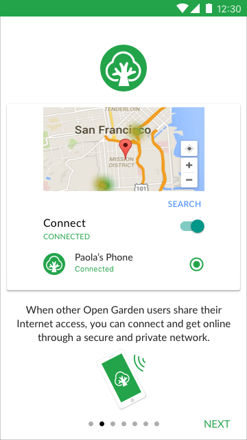
To allay the concerns of the existing user base, who worried that the introduction of currency would mean they could not continue to use the app to connect or share for free, I decided that the default screen would feature the Share and Connect controls, with no mention of cryptocurrency. Including on this screen a live map of active Open Garden users near you also demonstrated the value of the app and motivated (as seen in testing) users to make connections.
To help users feel more secure in sharing internet access with strangers, I designed a user profile feature, allowing people to create a username and avatar where previously users would have to connect to cryptic phone ID alphanumerics.

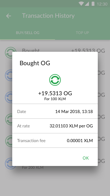
Initial designs based on Coinbase's buy/sell model showed high abandonment rates. Based on testing results, we could see that the major reason was that users could not see what their real costs would be and what real value they could gain. Armed with this insight, I created a UI that paired your real cost to what real value that would purchase. Subsequent tests showed abandonment rates dropped to a fraction of what they were.
At each step, I took prototypes of these features through rapid usability testing to validate design assumptions.
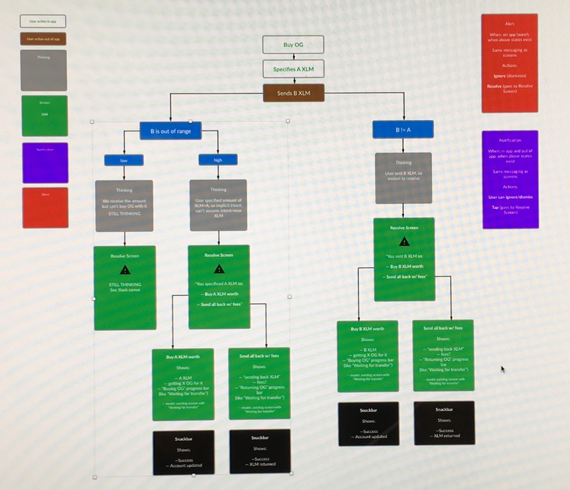
As stated above, the nature of the cryptocurrency exchange infrastructure meant we had to ask the user to leave our app, make an exchange through a wallet app or site, and return to our app. Incoming funds could also come from multiple places. This led to numerous potential fail or problematic states I had to map out, build interactive prototypes for, and test for fail states.
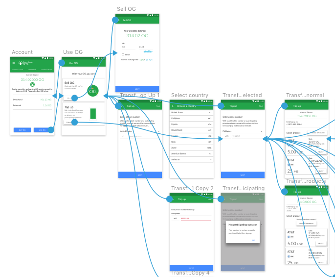
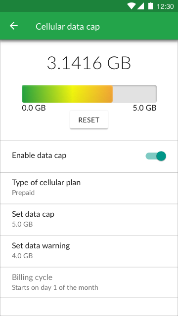
Other new features created included a data cap alert, a new onboarding, a transaction history, and privacy controls. I also tested and adapted the design language and assets to meet accessibility standards.
Testing: Where we're not demonstrating value
Through a mix of guerrilla and structured, in-person rapid usability testing, I checked each feature prototype with both crypto-savvy and, let's say "civilian" users. Testing within the company was not a viable option: everyone there was invested in building the app, so they did – or should – know how it worked already.
Using combinations of paper prototyping, InVision on mobile, and live code in moderated sessions, I compiled the qualitative data in Airtable. This allowed me to share my findings, stack rank problems that needed to be addressed, and compile where our language and design was confusing for novice or experienced users. You can find the template I created for this on Airtable Universe.

Delivery and Results: The campsite rule

Within a few months at Open Garden, I had:
Created a design/development workflow standardized around Zeplin and Abstract
Integrated this into our agile workflow schedule
Built a regular usability testing process
Built a design system
The goal was not just to deliver a polished product for shipping, but leave the design environment with a structure and organization. This is the campsite rule: always leave a place better than how you found it.
As we shipped my tested and revised designs, our average user review ratings on Google Play rose more than a half point. In addition, our installed base grew over fourfold, and – more importantly – so did our active weekly users.
It was a difficult and interesting challenge, and my first time leading product design at a startup. I've learned a lot, often by making mistakes. In the end, we were able to create something that reduced the confusion and frustration many people felt when faced with the concept of cryptocurrency, and preserved the communal mission of sharing internet access around the world.