
Building a distributed internet application at Open Garden
Open Garden’s mission was to enable distributed, democratized internet access, enabling any phone to become an access point or connect to one. The company grew to 30 people with international investors and reach after shipping products to Google Play and the App Store.
Over 12 weeks, I and my team tackled complexity and designed a tool that was clear, comprehensible, and reassuring for the users, the company, and its partners. The result: in testing, we saw a reduction of errors of over 50%.
Role: Lead Designer
Responsibilities:
Introduced user research to the company
Led user research efforts and evangelized the resulting insights to leadership, creating alignment on user-centered outcomes
Evaluated and prioritized feature needs and requests
Built a new Design System for the Open Garden identity
Championed security support for users
Led feature strategy and interaction design, showing a 500% increase in app downloads and and 350% increase in weekly user engagement, with primarily 4- and 5-star user reviews
Led design strategy with founders and stakeholders, mentored and managed junior designers
Built collaborative and agile design process with development team, reducing technical costs and errors
Built information architecture, wireframes, design system, high-fidelity assets
Rebuilt the interaction and information architecture of a task critical to the company business model to see an almost 80% reduction in user abandonment of the task
Previous development of the app had been done with no exposure to people outside of the team. My initial testing of the app showed this came with shortcomings, such as “you can use it if you already know how it works.”
I introduced the company to the value of user research and, for this use, of personas, It was encouraging to see engineers stop and examine the personas that I'd taped to the office walls.
I wanted to collect what a coherent life situation might be for someone who would find Open Garden interesting and useful – what problems are they facing, how do they interact with neighbors, what range of goals they might have, what would be too high a barrier for them to use the app? And this all had to be quickly comprehensible for non-designers on the team.
Matching usability to real-world needs

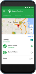
Working with my Lead Developer, I identified the most critical drop-off points for users. We agreed that the largest adoption issue was that users were not making it past the initial screen, which in the alpha version of the app, showed a list of alphanumeric access points (like a WiFi access point list) with no other information. Guerrilla usability testing confirmed that this UI sparked distrust in the quality and availability of all connections (users asked how close and how strong the connections would be), creating distrust in the app.
I saw my responsibility to prioritize that design issue before working on new, less critical features.
Through a combination of competitive analysis and more testing with interactive prototypes, I gathered enough data to show leadership that a map-based interface would:
reduce app abandonment (win for business goals)
require a small investment in design and development time (relatively low cost compared to user adoption gain)
create a better emotional connection between Open Garden users and Open Garden (qualitative results from testing)
Prioritizing to fill gaps first
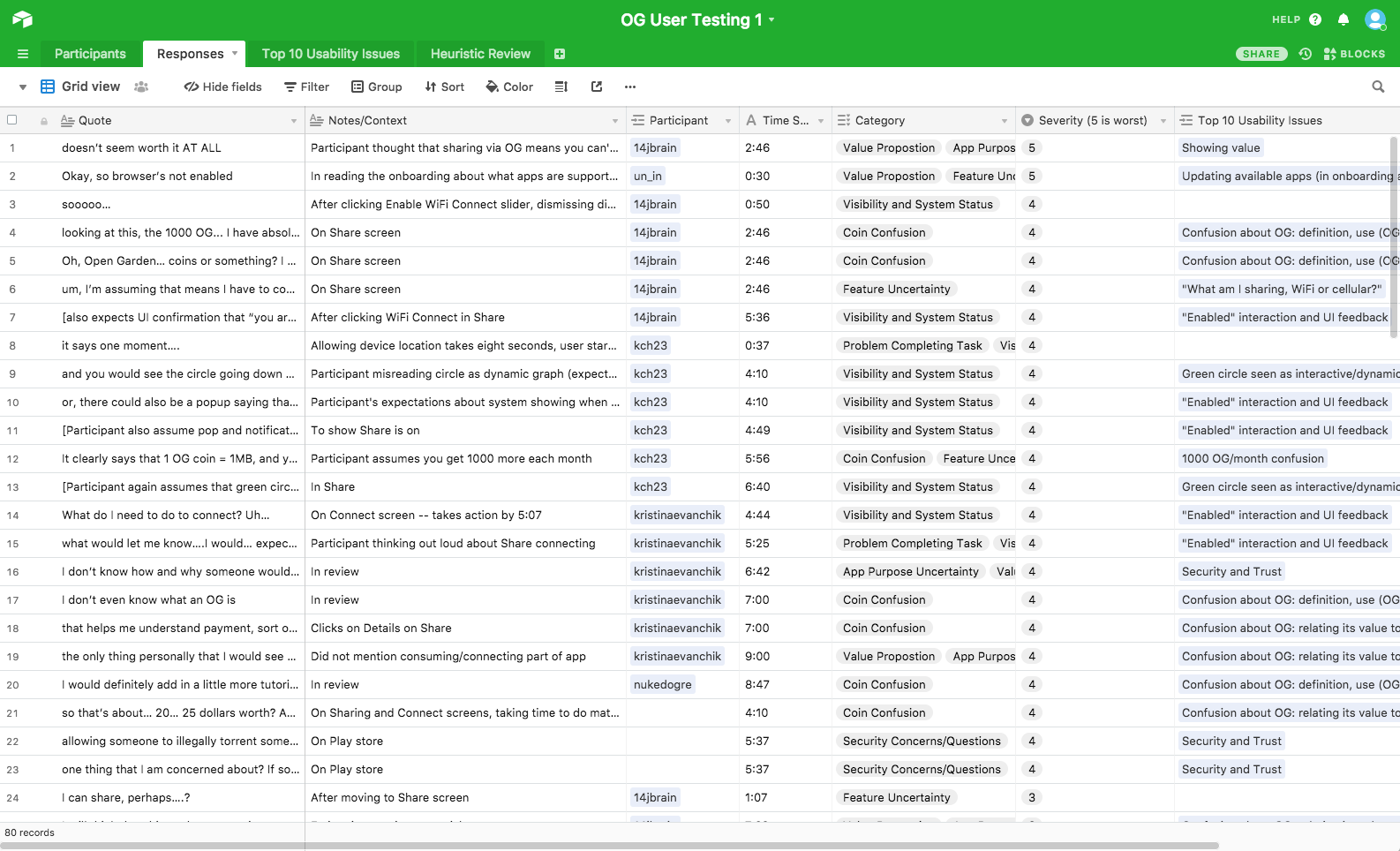
Through a mix of guerrilla and structured, in-person rapid usability testing, I checked each feature prototype with a representative range of user types. Testing within the company was not a viable option: everyone there was invested in building the app, so they did – or should – know how it worked already.
Using combinations of paper prototyping, InVision on mobile, and live code in moderated sessions, I compiled the qualitative data in Airtable. This allowed me to share my findings, stack rank problems that needed to be addressed, and compile where our language and design was confusing for novice or experienced users. You can find the template I created for this on Airtable Universe.
User research and usability testing to prioritize team work
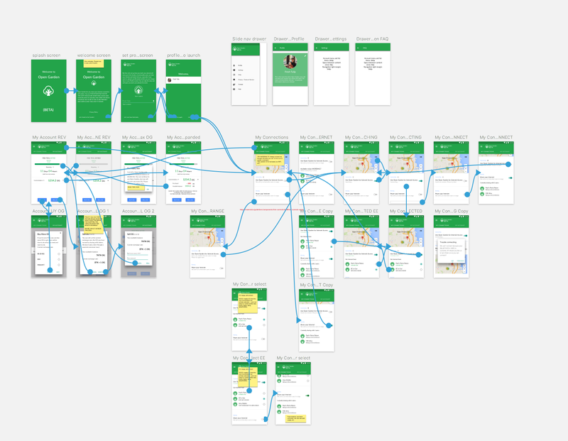
Working on Android and with Material Design for the first time, I did see a learning curve, but soon I was able to product interactive prototypes both for usability testing and, if validated, to deliver to developers for more easy and assumption-free implementation (top image).
I also designed and implemented a GitHub-based source of trust and versioning system using Abstract and Sketch. This allowed for rapid experimentation and tight feedback loops to help improve the app’s usability.
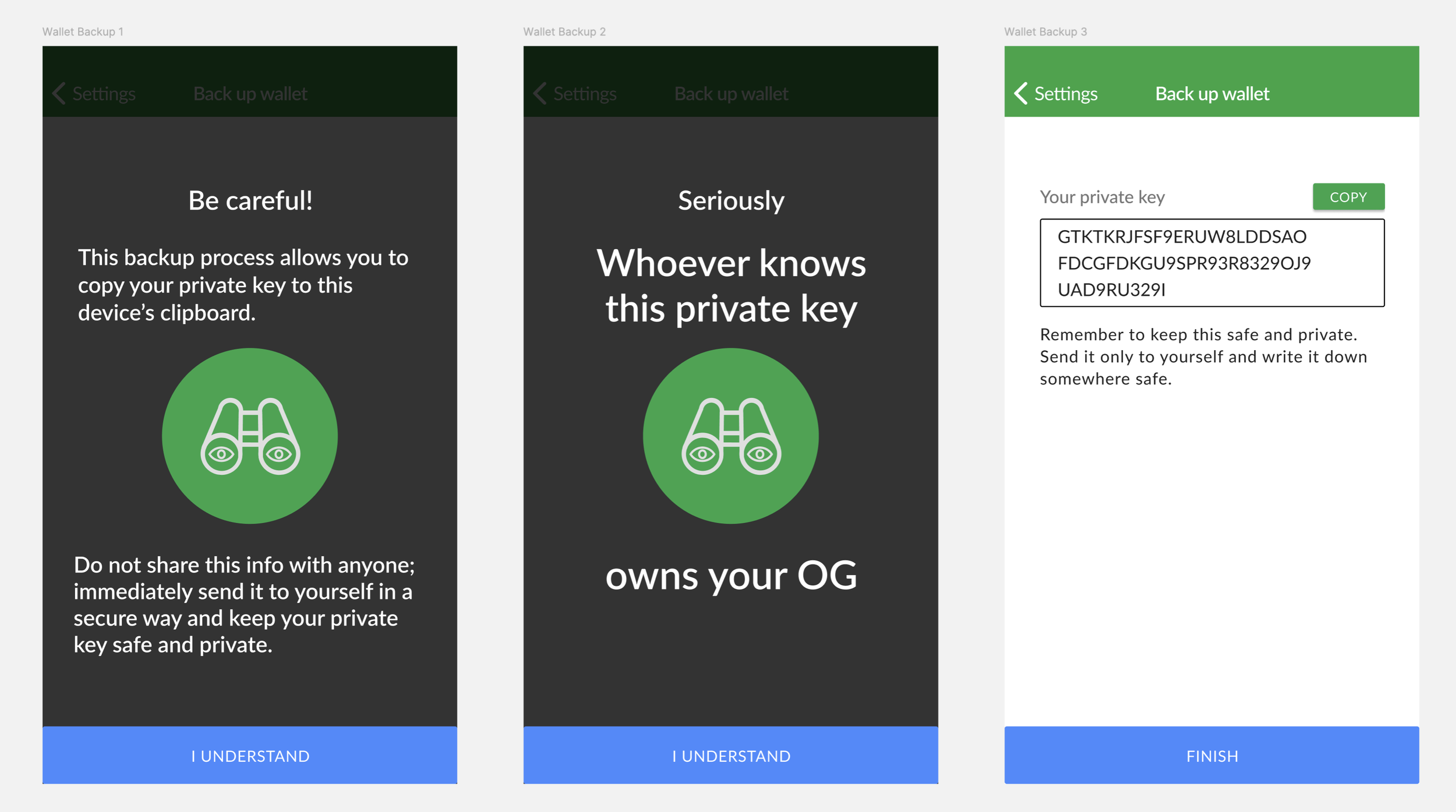
One of those testing loops showed that at a critical security interaction, users were tapping through a warning screen (as we’ve all been trained to do by EULAs). In this case, this — due to the nature of private wallet keys and a security vulnerability in Android’s clipboard — could result in the user’s entire wallet being drained.
I prototyped a version with a second-step warning screen, which larger and more plain language, to see if this would lead to users more closely considering the potentially vulnerable action. (I was inspired by the final boss screen of Guitar Hero II.)
Results showed that users did, in fact, pause on the second screen and consider the warning. In this case, designing in friction helped the user make a more informed choice.
User-first interaction design
Within a few months at Open Garden, I had:
Created a design/development workflow standardized around Zeplin and Abstract
Integrated this into our agile workflow schedule
Built a regular usability testing process
Built a design system
The goal was not just to deliver a polished product for shipping, but leave the design environment with a structure and organization. This is the campsite rule: always leave a place better than how you found it.
As we shipped my tested and revised designs, our average user review ratings on Google Play rose more than a half point. In addition, our installed base grew over fourfold, and – more importantly – so did our active weekly users.
It was a difficult and interesting challenge, and my first time leading product design at a startup. I've learned a lot, often by making mistakes. In the end, we had reduced the confusion and frustration many people felt when using the initial version of the app, and preserved the communal mission of sharing internet access around the world.
Delivery and results
