Designing and Delivering a Critical Internal Tool for Fulfilled by Google
Google needed a web-based tool for managing a complex system that featured millions of things (physical and virtual), time-critical messages, and communications of data between the company and third parties. The existing system used spreadsheets with custom scripts, emails, and phone calls, which made for a brittle system where users missed critical issues.
Over 12 weeks, I and my team tackled complexity and designed a tool that was clear, comprehensible, and reassuring for the users, the company, and its partners. The result: in testing, we saw a reduction of errors (resulting in poorer customer service) of over 50%
Role: Product Designer
Rapid understanding of complex domain knowledge
Working with client to understand their goals and needs
Led user research
Built journey maps and service blueprints
Uncovered key knowledge of critical communications in the complex systems,
Led and educated stakeholders about improving the IA of the system
Presented insights and recommendations
Led paper and digital prototyping sessions with users and stakeholders
Led usability testing of new system
Documented real-world improvements of the new design
Responsibilities:
We were a team of three Product Designers (including me), one Visual Designer, and a Product Owner. We worked in an Agile framework with two-week sprints. Each sprint included presentations to the client to share our findings, progress, and next steps.
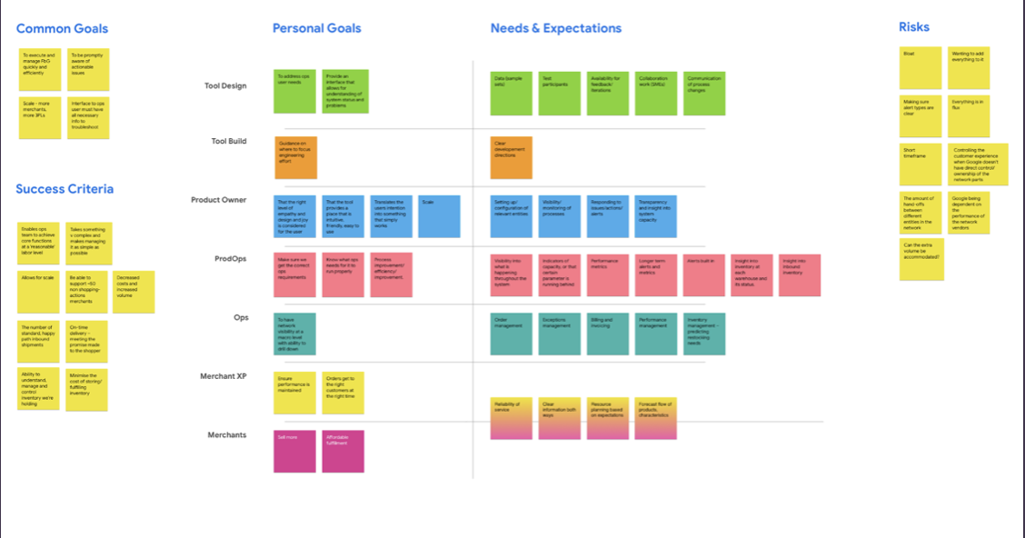
I and the Product Owner designed the agenda for and facilitated the stakeholder kickoff. We created a group exercise to uncover goals, needs, expectations, and risks. This helped us build our Statement of Work and gave us a starting point for our research sprints. We iterated this exercise after we shared our initial research findings.
Starting the Project with Client Alignment
Service Design for Critical Design Insight
I presented to the team the idea of mapping out all the necessary communications in the system. We had seen in our research that many critical failures had occurred when any part of the time-critical signals (“Did you receive X at the necessary time?”/”Yes, and I’m sending confirmation in the necessary time window”) broke. In the existing system, there was no insight into when these failed or were about to fail – unless someone made phone calls after the fact. The service blueprint I created was the first any of the client teams had seen of this. It also allowed us, when we built our MVP, to allow users to see when these communications occurred, needed to occur, or had not occurred.
So, I proposed: instead of building our tool around showing all information, we could build the tool around objects and their attributes, creating a simpler workflow.
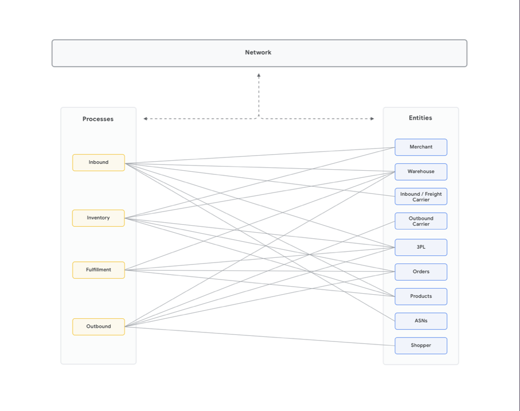
I audited the vocabulary third parties used for items across the system. This IA work showed that items and attributes had a many-to-many relationship. This dovetailed with our research that showed many user errors arose because of misunderstanding of terms. It also meant we didn't have to show all users all object attributes at once – only the ones relevant to the user at that moment. When we presented this to the client, they were able to see value in moving from their assumption of "the more information, the better".
Information Architecture for More (and Critical) Insights
I presented to the team the idea of mapping out all the necessary communications in the system. We had seen in our research that many critical failures had occurred when any part of the time-critical signals (“Did you receive X at the necessary time?”/”Yes, and I’m sending confirmation in the necessary time window”) broke. In the existing system, there was no insight into when these failed or were about to fail – unless someone made phone calls after the fact. The service blueprint I created was the first any of the client teams had seen of this. It also allowed us, when we built our MVP, to allow users to see when these communications occurred, needed to occur, or had not occurred.
So, I proposed: instead of building our tool around showing all information, we could build the tool around objects and their attributes, creating a simpler workflow.
I audited the vocabulary third parties used for items across the system. This IA work showed that items and attributes had a many-to-many relationship. This dovetailed with our research that showed many user errors arose because of misunderstanding of terms. It also meant we didn't have to show all users all object attributes at once – only the ones relevant to the user at that moment. When we presented this to the client, they were able to see value in moving from their assumption of "the more information, the better". This gave us room to pitch our idea about simplifying complexity.

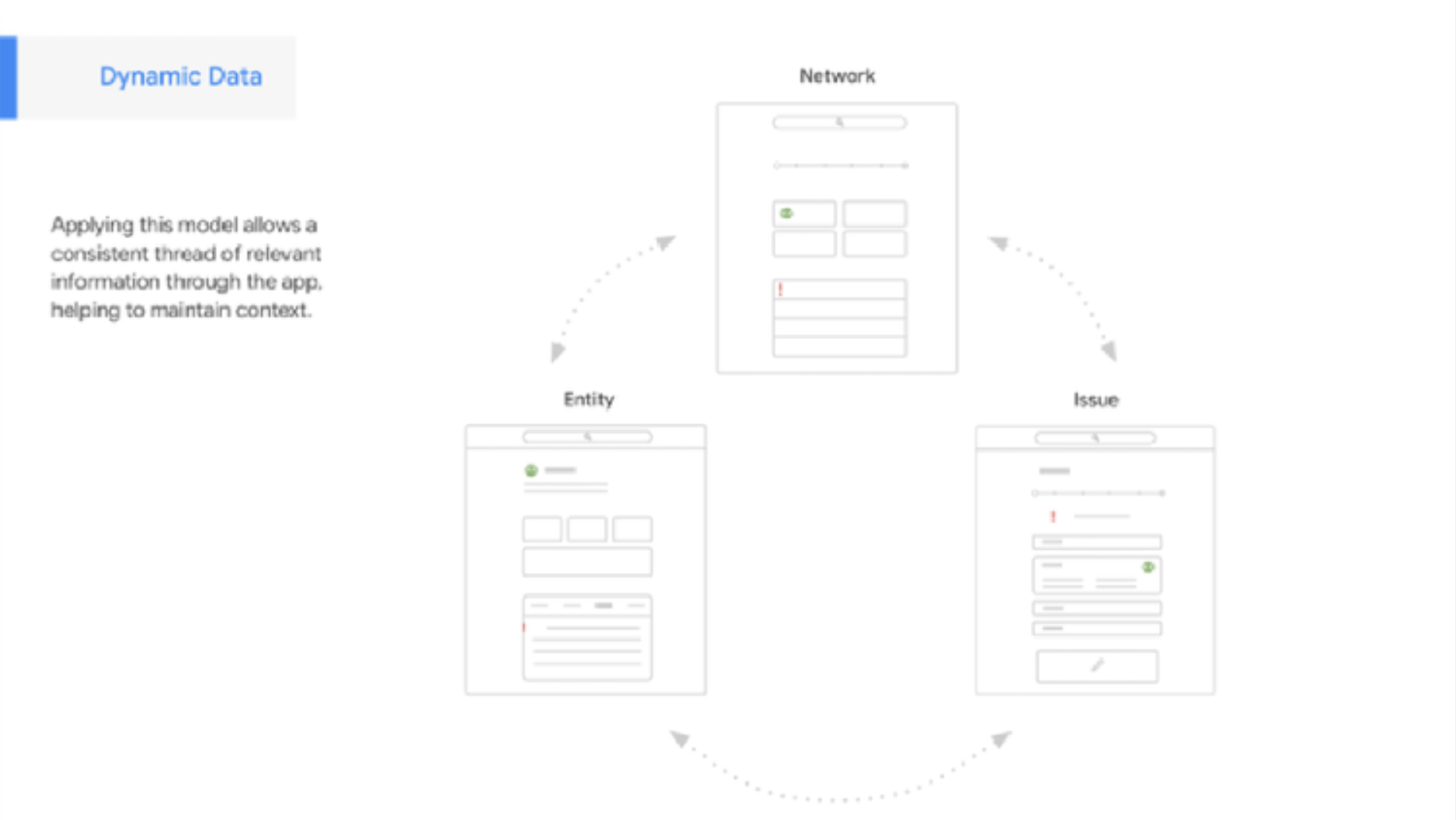
From this work, we could see that the users needed to handle items with many complex attributes. When thought of this as a faceted system, we could create an interface that showed these users only the attributes relevant to what the user needed to do. This allowed us to reduce the complexity to three basic interface templates: a view of the system, a view of a specific problem in the system, and a view of the object. Each view reduces to what the user needs to see based on the actions related to this view, while allowing paths towards deep dives. Creating these templates and interaction models also allowed us to center our design work on the components that were persistent across templates.
Creating an Object-Attribute UI
Co-Design and Prototyping with Users and Stakeholders
This, in turn, allowed us to move forward rapidly in our design sprints. We worked both on our own and in co-design and usability testing with both end users and stakeholders. We tested our assumptions about information hierarchy, and the arrangement and design of components. (Having done this conceptual work, we could run development of high-fidelity components in parallel to testing with paper prototypes).
And in turn, we could move quickly in usability testing and iteration. The object-oriented focus meant that the macro elements such as templates and components could be tested and refined in parallel with the micro elements. I had the most experience in usability testing on the team, so I built the testing protocols and helped the other designers feel more comfortable leading test sessions, either in-person or remote.
The components (not to be confused with widgets or affordances) were built to the client’s own design system and packaged as editable files.

Within 12 weeks we had delivered a mature, tested, and innovative blueprint. This helped Google to build the tool they wanted. We built out components using their preferred design system, met the goals in the Statement of Work, and could show that our work reduced the risks and increased expectations we had mapped out at kickoff. And we provided them with data that showed our object-oriented model led to lower errors, increased confidence in the system, and reduced anxiety on the part of users