Open Garden, Lead Designer
Open Garden’s mission was to enable distributed, democratized internet access, enabling any phone to become an access point or connect to one. The company grew to 30 people with international investors and reach after shipping products to Google Play and the App Store.
I built the first design process at the company, working with leadership and developers to increase alignment, streamline workflow processes, and reduce design and technical costs and debt.
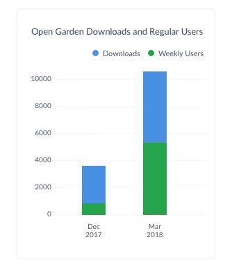
I also brought a culture of user advocacy, prioritizing feature and interface changes that increased usability, reduced task abandonment, and improved app downloads and user engagement by 5x.
Responsibilities
Led feature strategy and interaction design, showing a 500% increase in app downloads and and 350% increase in weekly user engagement, with primarily 4- and 5-star user reviews
Led design strategy with founders and stakeholders, mentored and managed junior designers
Built collaborative and agile design process with development team, reducing technical costs and errors
Built information architecture, wireframes, design system, high-fidelity assets
Rebuilt the interaction and information architecture of a task critical to the company business model to see an almost 80% reduction in user abandonment of the task
An App with a Mission
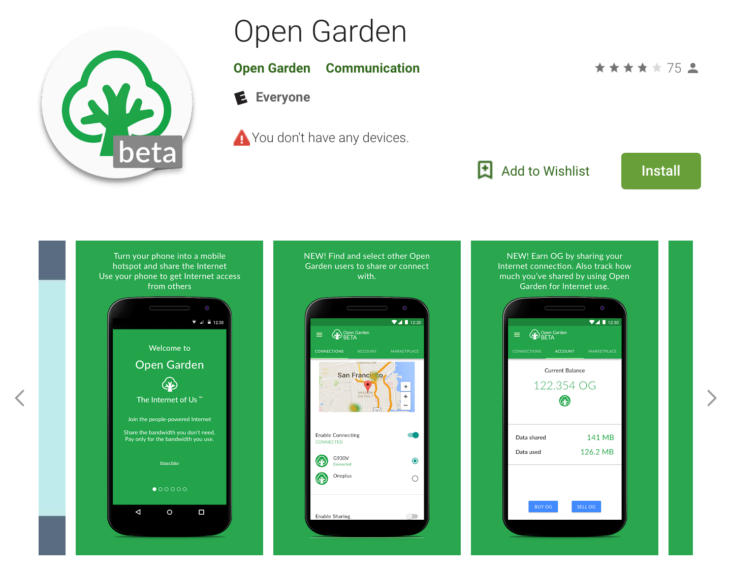
Open Garden initially shipped to the Google Play store and garnered solid reviews. The app was innovative in using peer networks to help people access the larger internet without incurring costly fees while traveling, or allow communities to share the costs of one internet access point and account.
I led the design and development of the product from a tech demo to shipping, with a 4.7 rating, an active community of users and advocates worldwide, and a 500% increase in downloads.
Centering User Needs to Redesign for Improved Access
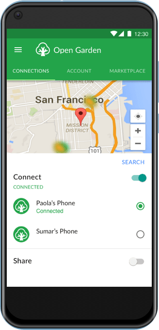
The original version of Open Garden centered the interface on lists of access points. My initial usability testing showed that this alphanumeric list (similar to a WiFi menu) left users to choose their access point at random, often leading to poor connectivity and a worse impression of the app.
Through competitive analysis and lightweight usability testing, I hypothesized that a map-first UI would meet users’ mental models and allow to more satisfactorily choose a reliable access point as they traveled.
I built interactive prototypes using this model and found, through usability testing, that users demonstrated an order of magnitude higher task completion rate and much lower reported frustration.
With this, I was able to drive leadership buy-in to develop and ship this new UI.
Grounding Design Decisions in Qualitative and Quantitative User Research
The company had no history of nor experience in user research, so I learned how to be an advocate for the practice, and how to ground the investment in how it will help leadership meet its goals, whether in user satisfaction or business goals.
I began building a database of potential users (travelers, people in shared living spaces) who were likely users of Open Garden’s product technology for sharing internet access. I led recruitment for usability testing (remotely using UserTesting or in person) and recorded and categorized the data in Airtable. In addition, I ran my own heuristic evaluation. This database allowed for ongoing and dynamic ranking of top usability issues, top challenges for users, and top insights.
This helped guide our roadmap and prioritization throughout the life of the product.

Designing for Transparency that Empowers Users
Building on the trust this success created with leadership, I prioritized new features that helped users learn to use the app efficiently and safely.
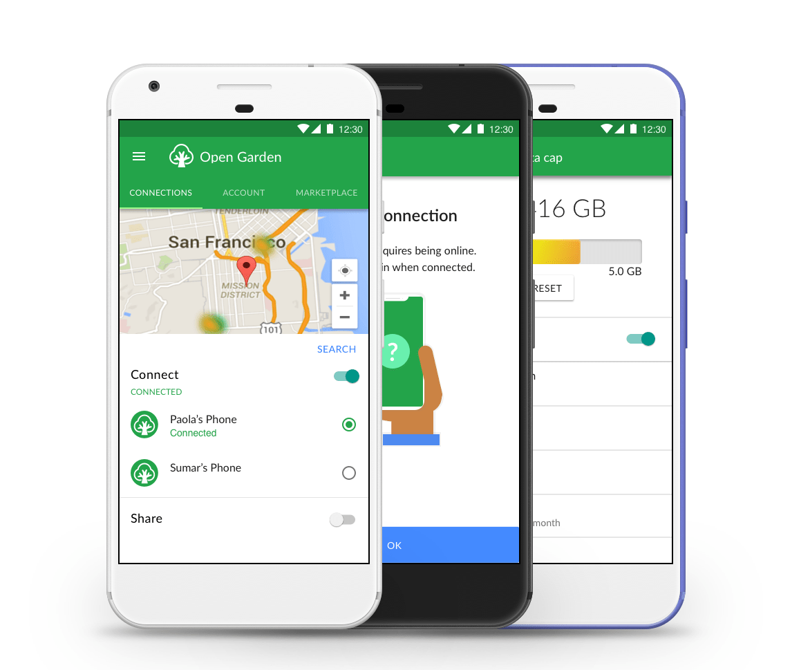
Creating an animated onboarding flow helped users begin getting benefit from using the app and addressed some concerns seen in early reviews.
Working with my lead developer, I led the creation of an active, responsive, and comprehensible feature that helped our users understand their remaining data usage. This reduced the incidence of users incurring extra data fees significantly.
Leading Interaction Design (IxD)
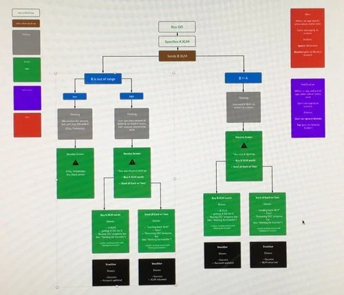
When leadership pivoted to adding a crypto component to the app, for buying and selling shared bandwidth, the complexity of user decisions and interactions increased exponentially. I faced the problem of mapping out user paths and creating interaction flows that made these processes simple. Adding to the complexity was the bidding for bandwidth process, which meant that a user’s offer might or might not be accepted.
To give me and my team a grounded understanding of this, and a reference for future work, I first mapped out the conditional logic of user states (top).
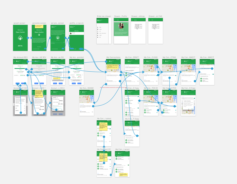
After building and expanding the visual language of the app, I created interactive prototypes. These helped me balance the cognitive load for interactions (where an extra step might test better than fewer steps with more data for the user to digest), test with the board of participants I had recruited, and guide the development team (middle).
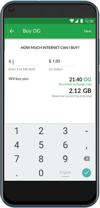
More complexity came about in that users had to mediate purchase of the app’s native coin through an intermediary coin. The design I delivered seems simple, but it can take a lot of work to achieve simple (bottom)!