Mixed-method User Research
I have a history of advocating for the user and for improving user outcomes, above chasing features or metrics. I’ve used my user research background to bring this understanding to planning and leadership.
User research and prioritizing features at Open Garden
As Lead Designer at Open Garden, I worked with my Lead Developer to identify the most critical drop-off points for users. We agreed that the largest adoption issue was that users were not making it past the initial screen, which in the alpha version of the app, showed a list of alphanumeric access points (like a WiFi access point list) with no other information. Guerrilla usability testing confirmed that this UI sparked distrust in the quality and availability of all connections (users asked how close and how strong the connections would be), creating distrust in the app.
I saw my responsibility to prioritize that design issue before working on new, less critical features.
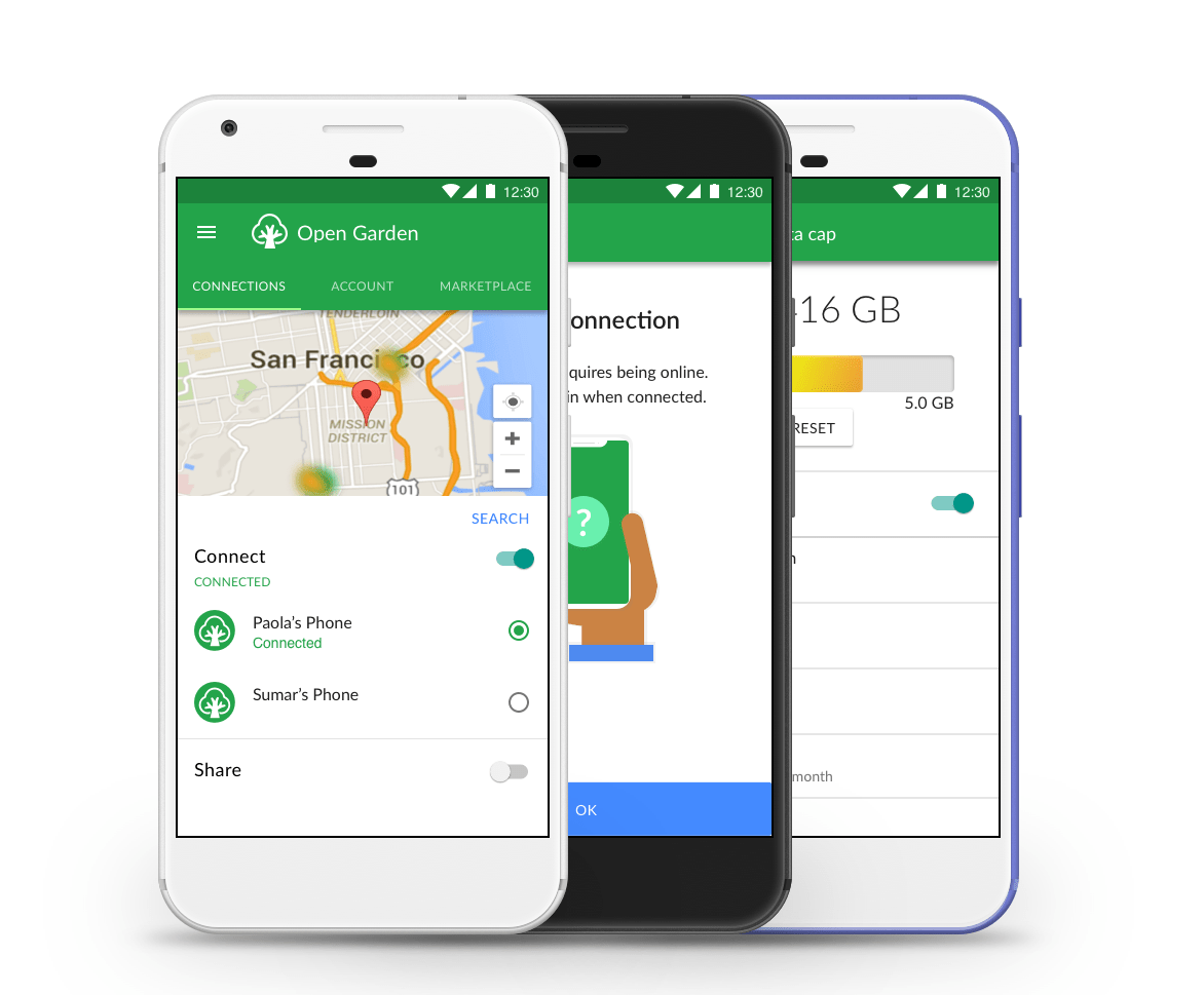
Through a combination of competitive analysis and more testing with interactive prototypes, I gathered enough data to show leadership that a map-based interface (top image) would:
reduce app abandonment (win for business goals)
require a small investment in design and development time (relatively low cost compared to user adoption gain)
create a better emotional connection between Open Garden users and Open Garden (qualitative results from testing)
Through a mix of guerrilla and structured, in-person rapid usability testing, I checked each feature prototype with a representative range of user types. Testing within the company was not a viable option: everyone there was invested in building the app, so they did – or should – know how it worked already.
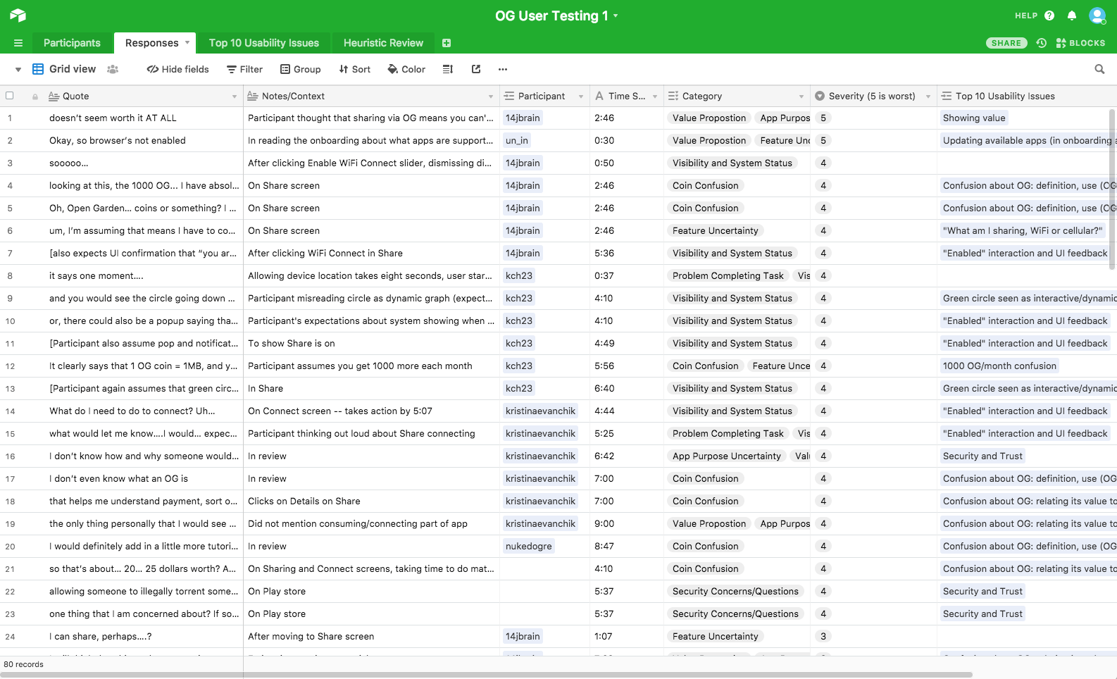
Using combinations of paper prototyping, InVision on mobile, and live code in moderated sessions, I compiled the qualitative data in Airtable (bottom image). This allowed me to share my findings, stack rank problems that needed to be addressed, and compile where our language and design was confusing for novice or experienced users. You can find the template I created for this on Airtable Universe.
Discovering user needs and mental models through user research
As a contact Product Designer for Clorox Professional, I was tasked with redesigning their professional web site to add a new product family. Advocating for user research, including interviews and usability testing, user analytics, and contextual inquiries led to new insights that made the client excited about a full redesign that more closely met the mental model of users. This resulted in reduced user frustration, higher sales for Clorox nationwide, and the design of a new mobile app that reduced the workload of Clorox field sales reps while improving sales.
Inquiries showed that the site was organized to represent marketing families, and did not match the user mental models found in my research. This meant that users seeking similar products for similar uses would have to navigate up and down the information hierarchy, making it hard for then to find and compare products.
Though the client was unfamiliar with user research, I advocated for usability testing with a sample of their target users first. I created testing protocols, explained the process to the stakeholders, and conducted remote and in-person tests using screen recorders.
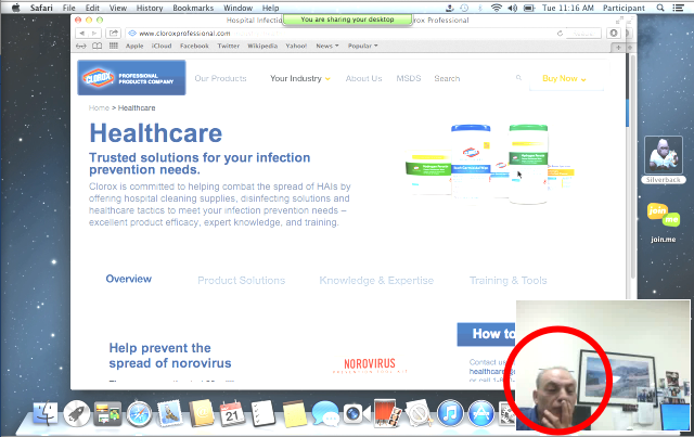
The tests did reveal a high task failure rate and a high degree of frustration when regular users of the site were asked to find and compare products that they used on a regular basis. This corresponded with their behavioral analytics, but it took the image of one user being frustrated (first image) to drive acceptance of the research findings.
This opened up the project for a more deep redesign. I created filter and search affordances based on how users thought of and categorized products: what type of product, where it can be used, what it can kill. Subsequent testing showed an over 80% drop in task failure rates.
The resulting site was so successful with users and the stakeholders that I was engaged to bring that design to the Clorox TouchPoint mobile app for Clorox field reps.

Co-authoring foundational research at Xerox PARC
As a User Researcher and Interaction Designer on Victoria Bellotti’s team at Xerox PARC, I was actively involved in both qualitative and quantitative user research, synthesis, and designing an updated timebanking mobile app that more easily and effectively met the users’ situations and needs. I was also a co-author of award-winning CHI papers “A Muddle of Models of Motivation for Using Peer-to-Peer Economy Systems” and “Why Users Disintermediate Peer-to-Peer Marketplaces”.
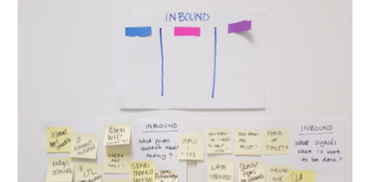
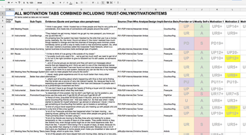
The research component consisted of competitive analyses and nearly a hundred hours of semi-structured qualitative interviews with people who had used timebanks or other goods- or service-exchange systems. I and my teammates used grounded theory practices to break apart the interviews into topical atoms, which we could then code along various motivational theory rubrics (first image).
The findings between the two papers were key in setting directions for app design in the peer-to-peer (P2P) marketplace area. Previous app developers had assumed an ideological alignment or commitment of users, leading to text-heavy apps that submerged the practical actions of P2P sharing.
In contrast, our work found that the vast majority of users were motivated along more practical axes; this lead to us creating new designs that foregrounded the actions of seeking or offering sharing of services or good. In our usability tests, we validation: over 70% more exploration and task engagement by participants.

Designing in friction to help users stay safe
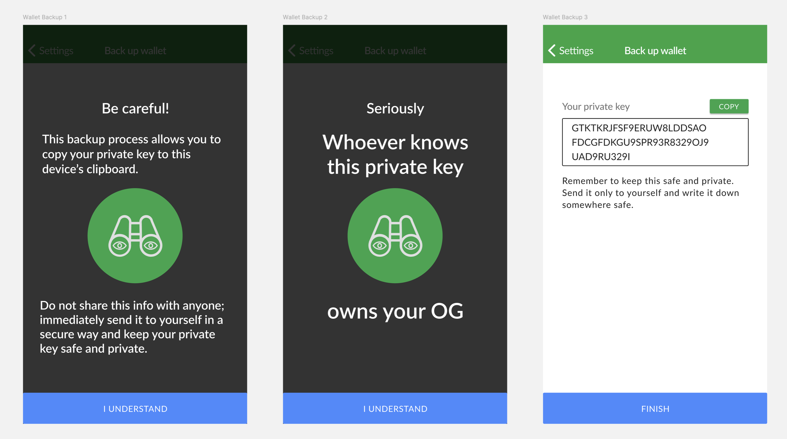
After a pivot by leadership, Open Garden added a cryptocurrency basis for buying and selling internet access over Bluetooth. This not only added complexity in designing and in interactions for the user (top image), but added a point of critical vulnerability: certain features would require the user to enter their private key to their crypto wallet.
If any bad actor knew your private key, they could take control and ownership of your wallet. In working with Android, I learned that (at the time), the OS could allow malicious apps to access the OS clipboard, which was a common means for users to copy and paste their long private key string. This meant that driving users to take this action, which was necessary for backing up a wallet, could be a vector that could lead them to lose everything.
In testing, the standard pattern of a warning page was not sufficient. Users tended to click through quickly, and reported they didn’t read the content (we’ve all been their with EULAs).
I thought back to the final stage of Guitar Hero II. As with all stages, it asked if you wanted to play the next song, but if you clicked yes, it added, “Do you REALLY want to play Free Bird?” If I could remember that after years, maybe the added step would get attention from users.
And in testing, it did! Instead of clicking through to the problematic step, users saw another warning screen (bottom image) with more direct language in larger text (which was also approved by the legal team). Users stopped and read the content, and could remember the warning. This led users to consider the risk, which was a safety improvement.