Being the voice of the user
I have a history of advocating for the user and for improving user outcomes, above chasing features or metrics. I’ve used my user research background to bring leadership,
Understanding user needs to map out a new service model and interface
Google contracted Potato LLC to help them rebuild an internal service to manage a two-day shipping consumer service, Fulfilled by Google. I and my team went from zero to delivering a visually simplified and focused administrative interface that reduced operator stress, time to identify and mitigate issues, and overall issues in delivery of customer goods.
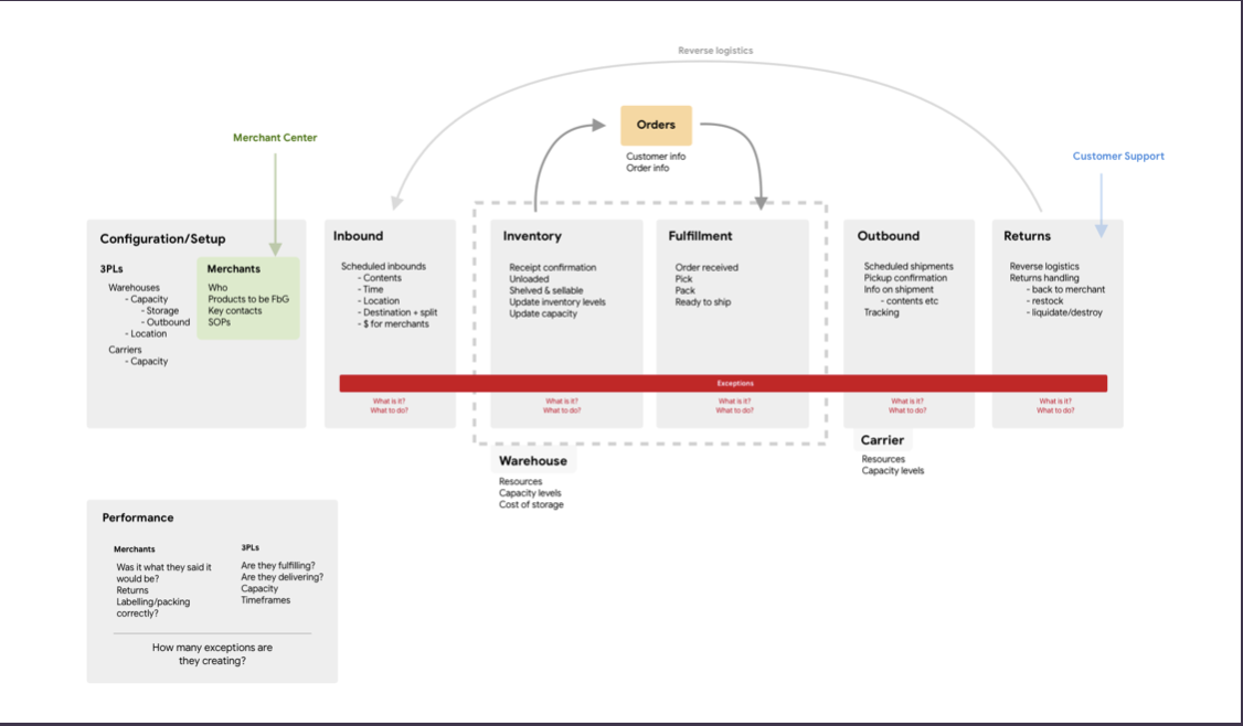
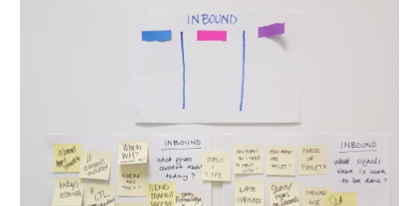
With another designer on my team, I mapped out the actors and processes in the entire system, from customers ordering a product online to receiving it, with all the actors and systems that worked in a complex interchange of data and objects (top two images).
From our user research with operators, we had learned that operators needed to examine every shipping object at every stage and manually confirm every step with shipping, storage, and 3PL parties.
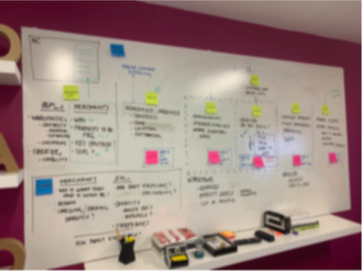
This allowed me to build a service blueprint (third image) that uncovered where critical communications needed to occur, including signals that one of these was received and is being acted on. This allowed me to propose that the existing interface, which exposed the entire backend data about every object, was not necessary. What if we oriented the interface to expose only the data that operators needed?
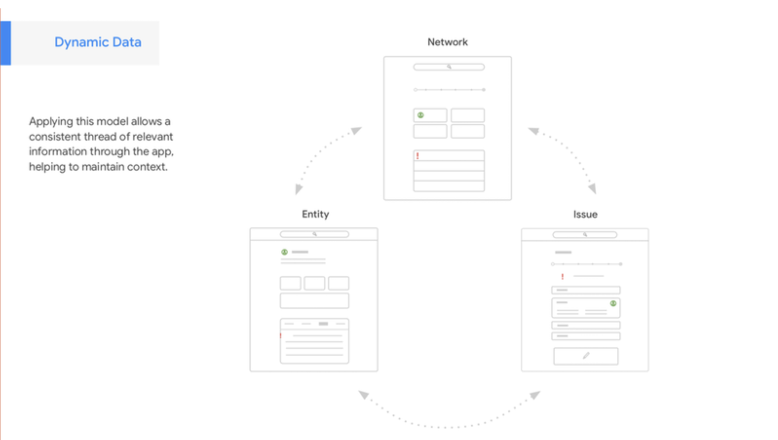
With that user-centered and data-centered mindset, my team and I were able to design, test, and build an interface model that freed the operators from seeing hundreds, if not thousands, of items in the system in a table format. Instead, the system could present them with views into the complex data, showing them relevant information that applied to their main workflows: monitoring the status of an item in the system, mitigating an issue in the system, and monitoring the overall health of the system,
As a result, in testing, we saw operators report much lower stress levels, reduced time and effort to address issues, and a much lower operator error rate.

Discovering user needs and mental models through user research
As a contact Product Designer for Clorox Professional, I was tasked with redesigning their professional web site to add a new product family. Advocating for user research, including interviews and usability testing, user analytics, and contextual inquiries led to new insights that made the client excited about a full redesign that more closely met the mental model of users. This resulted in reduced user frustration, higher sales for Clorox nationwide, and the design of a new mobile app that reduced the workload of Clorox field sales reps while improving sales.
Inquiries showed that the site was organized to represent marketing families, and did not match the user mental models found in my research. This meant that users seeking similar products for similar uses would have to navigate up and down the information hierarchy, making it hard for then to find and compare products.
Though the client was unfamiliar with user research, I advocated for usability testing with a sample of their target users first. I created testing protocols, explained the process to the stakeholders, and conducted remote and in-person tests using screen recorders.
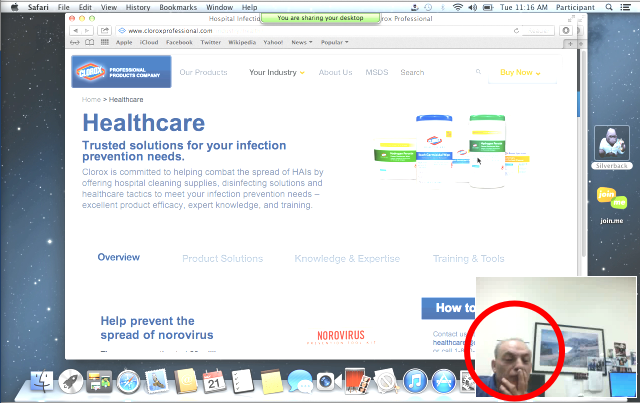
The tests did reveal a high task failure rate and a high degree of frustration when regular users of the site were asked to find and compare products that they used on a regular basis. This corresponded with their behavioral analytics, but it took the image of one user being frustrated (first image) to drive acceptance of the research findings.
This opened up the project for a more deep redesign. I created filter and search affordances based on how users thought of and categorized products: what type of product, where it can be used, what it can kill. Subsequent testing showed an over 80% drop in task failure rates.
The resulting site was so successful with users and the stakeholders that I was engaged to bring that design to the Clorox TouchPoint mobile app for Clorox field reps.

User Research and Competitive Analysis to prioritize UI models for users
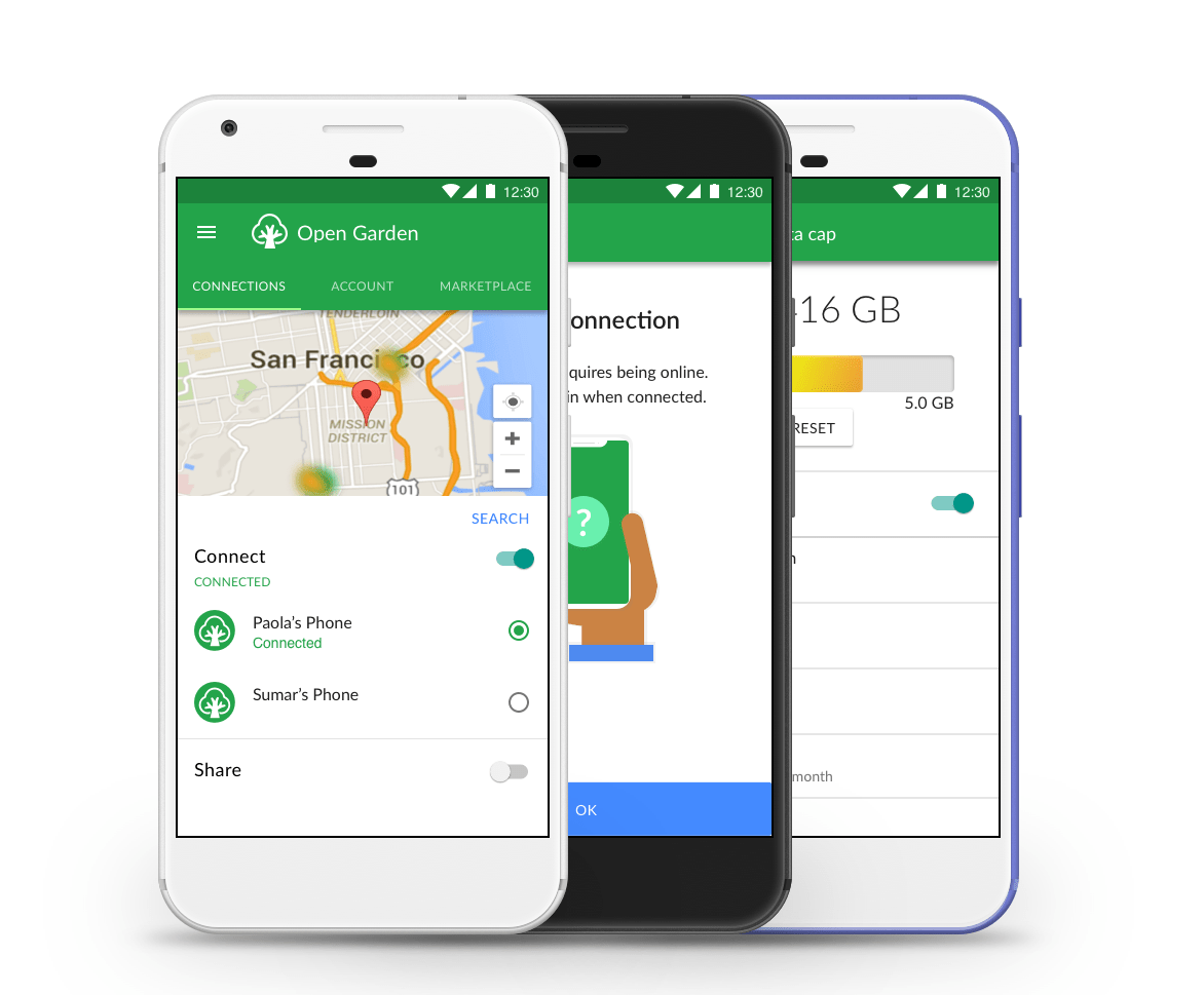
When I came on as Lead Designer at the startup Open Garden, the home screen, which allowed users to get internet access via shared mobile hot spots, displayed to users a list of device names and numbers, with no indication of proximity or quality. App usage stats showed that users often didn’t continue from that point, ultimately abandoning the app. What was the problem, and how might we enable users to continue more easily?
I initially conducted some guerrilla testing, the people I met were put off by that list, and many refused to complete the task (“Join A53FF2?”).
I saw my responsibility to prioritize that design issue before working on new, less critical features.
Through a combination of competitive analysis (such as popular interfaces for choosing WiFI connections) and more testing with interactive prototypes, I gathered enough data to show leadership that a map-based interface would:
reduce app abandonment (win for business goals)
require a small investment in design and development time (relatively low cost compared to user adoption gain)
create a better emotional connection between Open Garden users and Open Garden (qualitative results from testing)
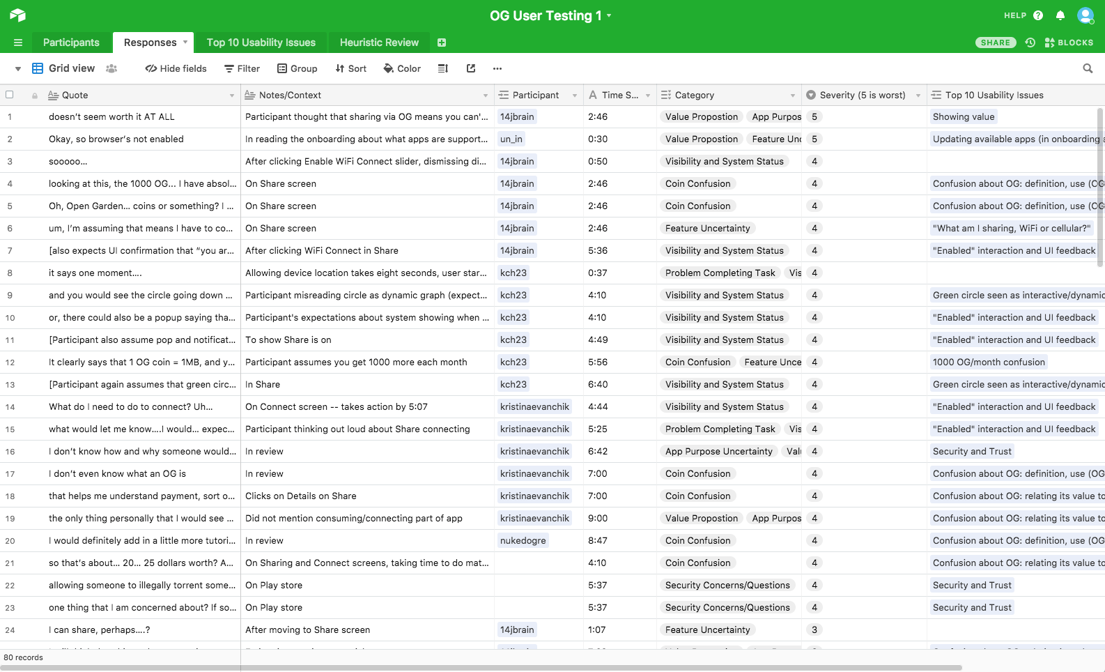
I also built a tracker in Airtable to categorize, cross-reference, and track ongoing qualitative research, my heuristic evaluations, and change over time through the life of the product.
After we shipped the new interface, download and usage rates increased significantly, and ratings on the Google Play store rose by over a point.
Designing in friction to help users stay safe
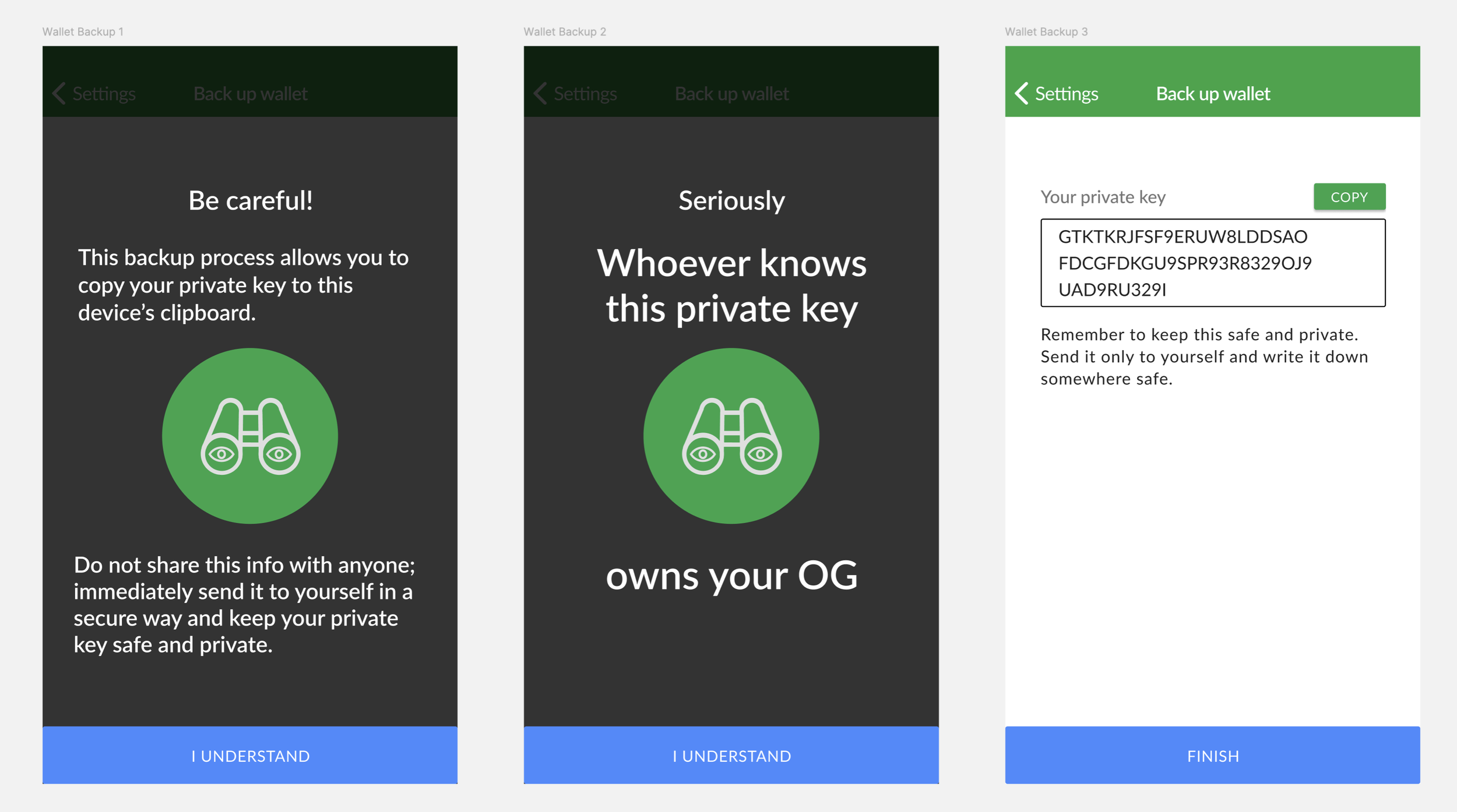
After a pivot by leadership, Open Garden added a cryptocurrency basis for buying and selling internet access over Bluetooth. This not only added complexity in designing and in interactions for the user (top image), but added a point of critical vulnerability: certain features would require the user to enter their private key to their crypto wallet.
If any bad actor knew your private key, they could take control and ownership of your wallet. In working with Android, I learned that (at the time), the OS could allow malicious apps to access the OS clipboard, which was a common means for users to copy and paste their long private key string. This meant that driving users to take this action, which was necessary for backing up a wallet, could be a vector that could lead them to lose everything.
In testing, the standard pattern of a warning page was not sufficient. Users tended to click through quickly, and reported they didn’t read the content (we’ve all been their with EULAs).
I thought back to the final stage of Guitar Hero II. As with all stages, it asked if you wanted to play the next song, but if you clicked yes, it added, “Do you REALLY want to play Free Bird?” If I could remember that after years, maybe the added step would get attention from users.
And in testing, it did! Instead of clicking through to the problematic step, users saw another warning screen (bottom image) with more direct language in larger text (which was also approved by the legal team). Users stopped and read the content, and could remember the warning. This led users to consider the risk, which was a safety improvement.