Making Information Accessible
Whether within an app or web page, or helping teams make sense of a mess of things and types, my experience in IA has helped deliver simple interactions from complicated content
Fluid Inc.: How Can We Help Customers Find Burt’s Bees?
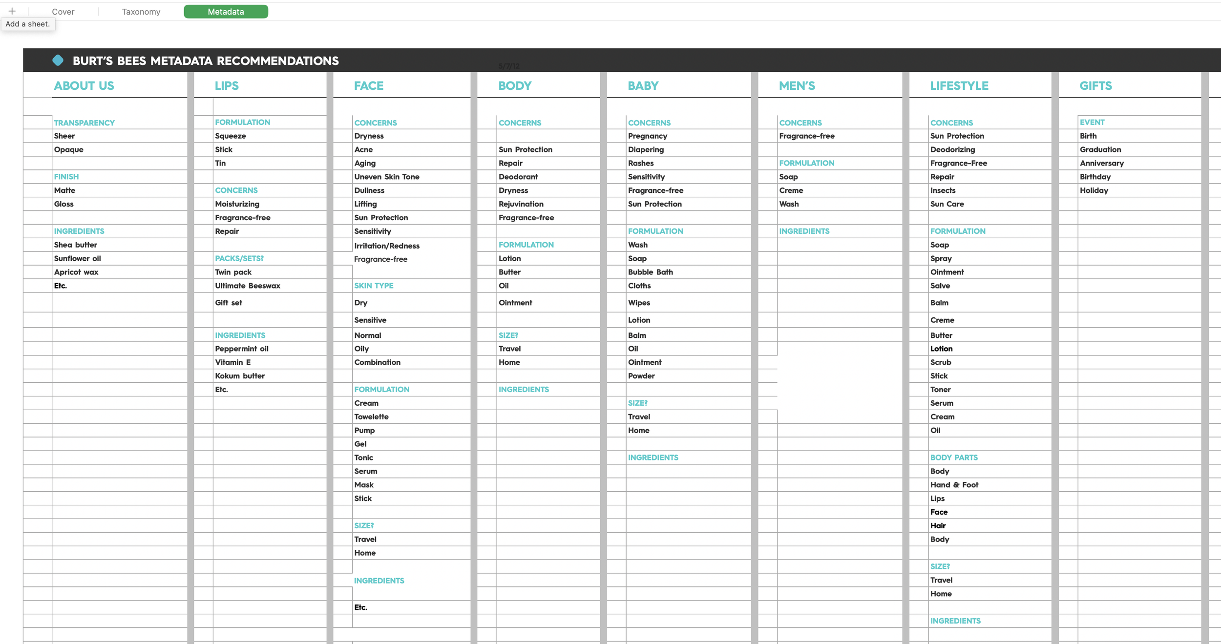
As a contractor for Fluid, Inc., I was tasked with creating a customer-centric taxonomy for all the products Burt’s Bees might display for sale in retail drugstores across the county.
My work began with understanding how customers and retailers already thought of the products. I observed people approach existing sales towers, talked with a range of them, and talked with managers about how they thought of the various products.
With this data in mind (and in a spreadsheet), I conducted card sorts with customers to see how they grouped and categorized items. With this and desk research in hand, I was able to deliver a new way of grouping products that proved easier for customers to locate, compare, and contrast within their mental models. This was adopted at the corporate level and you might have already seen the outcome!


In my first year of classes at the School of Information at UC Berkeley, I was asked by a professor to contribute to a textbook he had envisioned.
This turned into becoming lead co-author of a chapter in The Discipline of Organizing, a graduate-level textbook and ASIST information science “book of the year” in 2014.
The Discipline of Organizing
On the Fulfilled by Google project, we felt that the existing UX for operators — massive tables that replicated the backend spreadsheets — was making both basic actions and seeing the health of the system burdensome. (Rapid usability testing and logged error rates confirmed this.)
How might we design something that help operators both see only what they need to see and be able to take quick action?
Instead of building our tool around showing all information, we could build the tool around objects and their attributes, creating a simpler workflow.
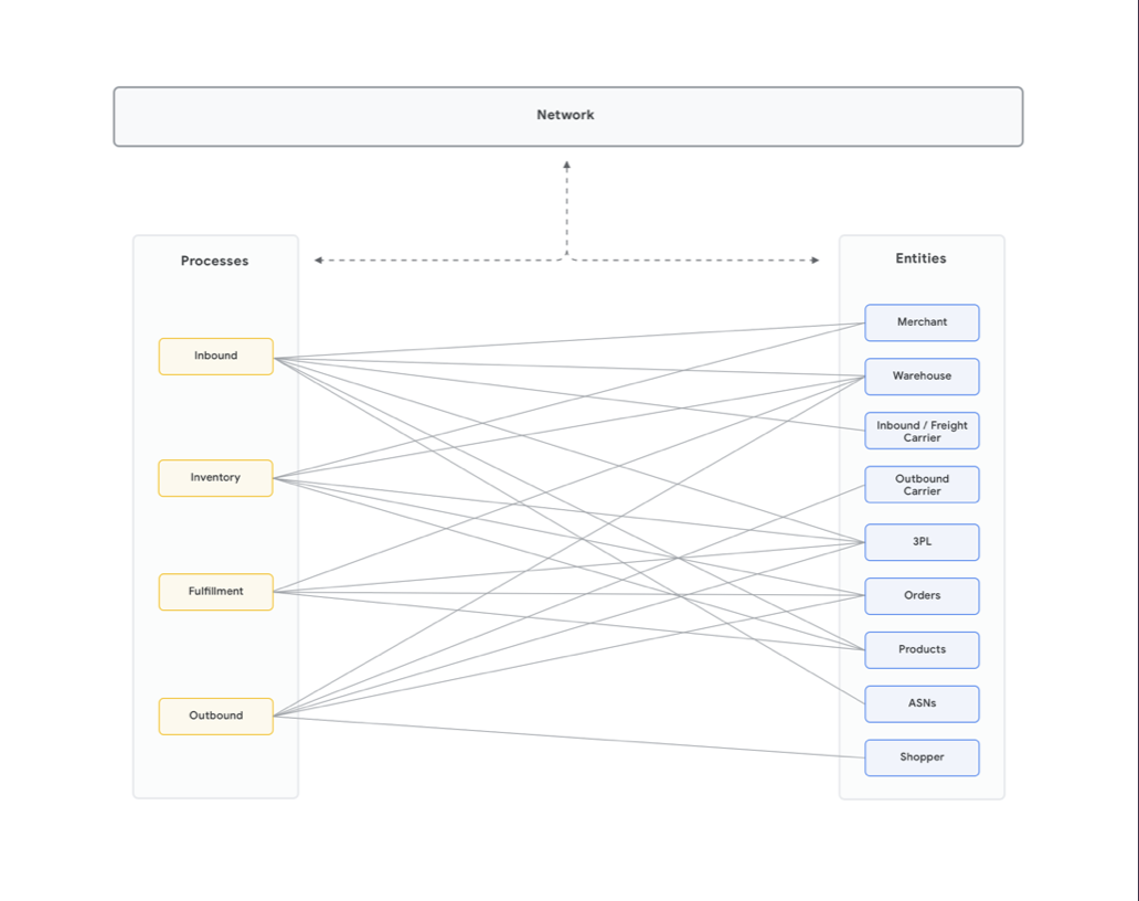
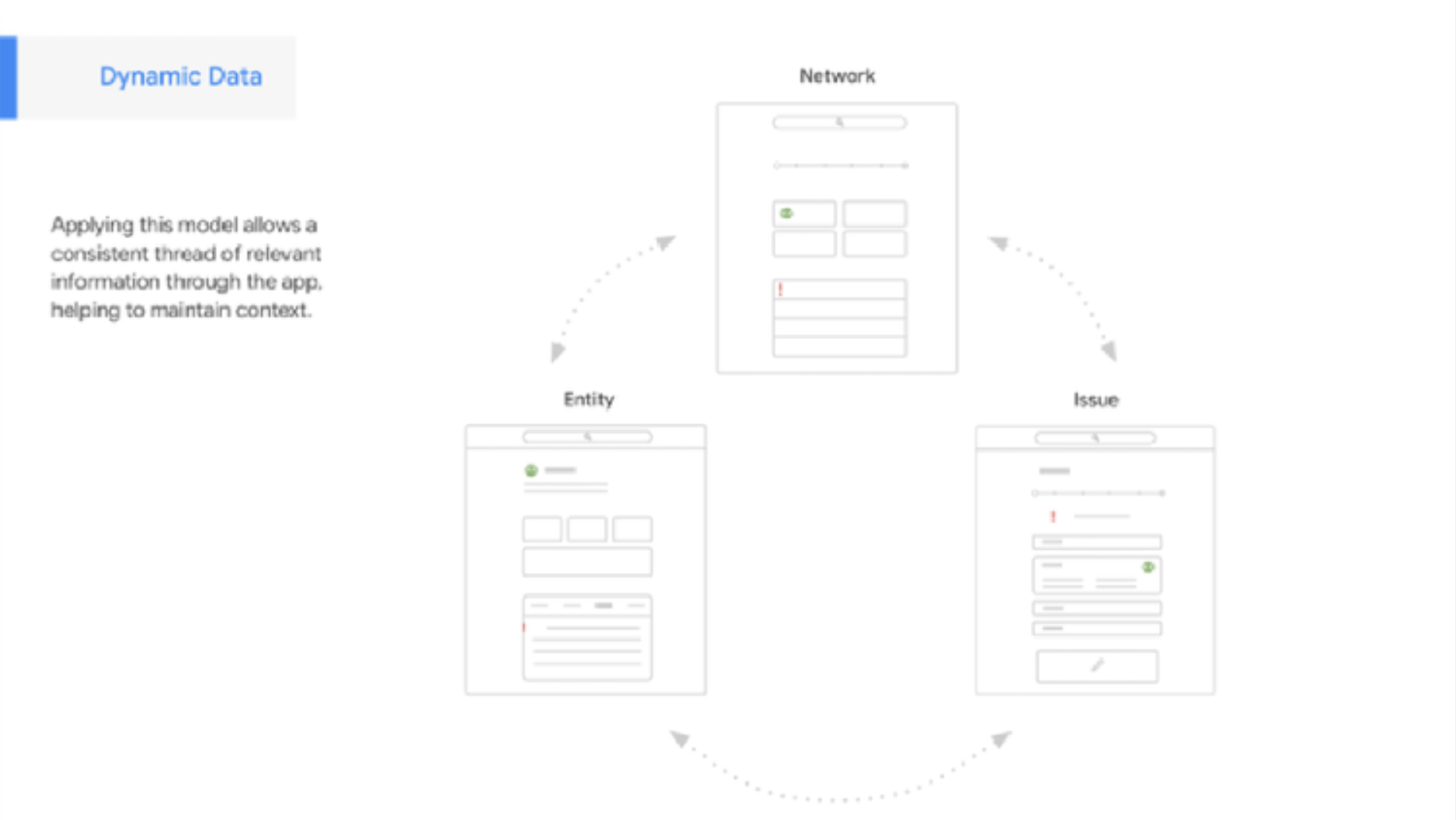
I worked with another designer to audit the vocabulary used for items across the system by various third parties. This IA work showed that items and attributes had a many-to-many relationship (top image). This meant we didn't have to show all users all object attributes at once – only the ones relevant to the user at that moment (bottom image). When we presented this to the client, they were able to see value in moving from their assumption of "the more information, the better". This gave us room to pitch our idea about simplifying complexity.
IA that Leads to New UX